Notable — A UX Case Study
Introduction
Notable is a 7-week student design sprint completed from October to November for Design Interactive’s Fall 2024 Cohort. Our product was motivated by the lack of an existing, flexible, and customizable note-taking application that caters to the diverse needs of users, such as for work, school, or day-to-day life. Our goal was to design a note-taking application that allows users to capture and organize their thoughts quickly and effortlessly, no matter where they are.
Awarded: Strategic Design & Communication
Problem Statement
Responsibilities and Timeline
Meet The Team
Timeline
Research
Research Goals
Our product was motivated by the lack of an existing, flexible and customizable note-taking application that caters to the diverse needs of users, such as for work, school, or day-to-day life. Our goal was to design a note-taking application that allows users to capture and organize their thoughts quickly and effortlessly, no matter where they are.
User Surveys
We started off our user research with a survey to gain a better understanding of our user base as a whole. Out of the 35 responses we received, here are the stats that stood out to us:
- 55% of our respondents use note-taking applications for school
- 74% use a laptop or computer as their primary note-taking device
- Most surprisingly to us, Google Docs was the most popular note-taking application, with 57.1% of our respondents using it
Competitive Analysis
Next, we conducted a competitive analysis with the most popular note-taking applications reported in our survey: Google Docs, Apple Notes, Notion, and Goodnotes.
- The most common features users liked about these applications were quick and easy access and editing of notes and adaptability to different note-taking styles.
- The most common pain points were awkward formatting of imported media, the need for a stable internet connection, and poor support for collaboration
Based on our user survey and competitive analysis, we concluded that:
- Our application should have the ability to import a variety of media formats (such as photos, lecture slides, PDF’s), as well as customizable organization options, and be convenient and free to use.
- The pain points we aimed to address were a cluttered and distracting interface, poor media formatting options, and poor organizational customizability.
User Interviews & Insights
After analyzing our user surveys, we noticed that a large portion of our data came from students. In order to tackle this variable, we decided to conduct four user interviews — 2 with full-time students and two with 2 working professionals. We did this to gain a better understanding of the different demographics who take notes.
After these interviews, we learned that many individuals take different types of notes depending on their occupation. For example, a working manager stated that he took meeting notes and liked incorporating actionable items like following up with team members and clients. He also stated that his team’s calendar had a huge impact on his work productivity. On the other hand, both of the full-time students used notes for their coursework and extracurricular activities.
During these interviews, we gained insights into our different user’s needs, pain points, and goals. As a result, we wanted to design a note-taking application that was inclusive and best fit the needs of all people.
Ideation
Affinity Mapping
Using our user interview results we conducted affinity mapping to summarize what users want for a note-taking application into three categories:
- Organization: where users want an easy, quick way to access their notes
- Collaboration: where users want to easily communicate their notes with others — this mostly applies to professionals who wish to share timeframes of projects efficiently
- Efficiency & Speed: where users want to take notes quickly
Low-Fidelity Sketches
These insights directly informed the creation of our low-fidelity sketches. To address Organization, we prioritized simple, intuitive navigation that allowed users to quickly access and categorize their notes; this came in the form of a “pin” feature on users’ dashboards. For Collaboration, we sketched features that facilitate easy sharing, particularly, calendar designs to help professionals communicate faster. Finally, to support Efficiency & Speed, we created sketches that would aid in minimizing steps users would have to take for note-taking, with photo format sketches. The sketching phase allowed for a more rapid and flexible ideation process, helping us to experiment with multiple design directions before committing to more detailed and interactive versions for the mid-fidelity prototyping phase.
User Flows & Core Features
We established five core features and subsequently five user flows by using the affinity mapping categories and sketches to map out the connections between pages for each feature. The user flows ensured that each interaction would be intuitive and user-friendly. Mainly, we focused on perfecting the flows for organization-based and efficiency-based sketches, as we believed that both categories were the most valued by users, according to the survey.
Below are the features:
- Onboarding: Allows new users to set their note-taking preferences, with the app customizing their dashboard using pins to streamline accessibility and organization of notes.
- Customizable dashboards with pins: Similar to Apple widgets, pins are customizable displays of information that allow users to select and showcase the content they find most relevant on their dashboards, aiding with organization and efficiency of note-taking.
- Photo import formatting: To tackle the problem of picture formatting found in the survey and help users take notes efficiently by providing a grid for users to add their photos into.
- Shared and individual calendars: To address the collaboration aspect and allow users to communicate faster.
- Creation of different types of documents: Enables users to create a variety of note formats, allowing them to take notes more efficiently based on their specific needs and preferences.
Mid-fi Prototyping
During the mid-fidelity phase, we created various iterations of mid-fi’s based on our lo-fi’s. We discussed various layouts to determine which would be the most user-friendly and navigable. We used the user flows to aid us in transitioning our sketches into seamless and connected designs. This phase helped us narrow down the features to focus on for further designs and prototyping. Mainly, that’s adding a pin prototype, adding events in the calendar prototype, photo import prototype, and designing more pins.
Usability Testing
During our usability testing phase, our team conducted five usability tests with 2 working professionals and 3 full-time students. During these tests, we had our testers complete the following tasks:
- Onboarding as a new user
- Navigating between three different dashboards
- Creating a new document in a specific folder
- Editing a pre-existing document by adding text and importing an image
From these tests, we were able to pinpoint errors and pain points within our mid-fidelity flows. We learned that users struggled with finding specific notes as there were no search or sorting features. Some users stated that they were unsure of the dashboard pins functionality. While others claimed that steps to import the image and navigate to the folders were unclear and confusing. Lastly, we also learned that our navigation bar was difficult to navigate and did not match corresponding folder pages.
Hi-fi Prototyping
Design System — Colors and Typography
For our design system, we focused on simplicity. Black and white serve as the primary colors, creating a clean and neutral foundation, while pastel secondary colors act as accents to differentiate between dashboards. These accents are customizable to fit user preferences — a key decision informed by our user interviews. We learned that many users organize information, such as notes, tasks, or dashboards, by assigning colors or symbols that align with their personal workflows. By designing with these existing mental models in mind, we aimed to create a UI that felt familiar yet adaptable to our diverse user needs.
Design System — Components
Continuing with the theme of familiarity, we designed our components using established dashboard patterns, such as a sidebar for navigation and modals to house our pins. One of the more exciting aspects of the process was prototyping directly within these components. By linking interactions to their respective variants, we created a dynamic and cohesive user flow. This approach also gave us the opportunity to integrate motion design elements, ensuring that animation curves and timing were consistent throughout the interface, resulting in a more fluid and connected experience across the application.
Hi-Fidelity Prototype — Onboarding:
The goal of the onboarding experience is to ease users into the application by providing them with helpful content right from the start. Specifically, we aimed to introduce key features by pre-populating their dashboard with pins, allowing users to see and interact with these elements immediately. This approach ensures that users don’t face a completely blank screen, which can feel intimidating or confusing. Instead, they’re able to start using the application right away, making the experience more intuitive and engaging from the moment they sign up.We introduced pins of varying sizes to specifically address key user pain points, such as the need for quick notes, action items, and essential information at a glance. By adjusting the pin sizes, we can highlight more important or frequently used items while still keeping less critical elements easily accessible, making it simpler for users to quickly access and interact with the most relevant parts of their workflow.

Hi-Fidelity Prototype — Adding Pins:
We introduced pins of varying sizes to specifically address key user pain points, such as the need for quick notes, action items, and essential information at a glance. By adjusting the pin sizes, we can highlight more important or frequently used items while still keeping less critical elements easily accessible, making it simpler for users to quickly access and interact with the most relevant parts of their workflow.

Hi-Fidelity Prototype — Switching Dashboards:
Existing users can sign in and easily customize their dashboards to fit different areas of their lives. They can create separate dashboards for aspects like student life and professional life, using color to distinguish between them. This customization enables users to organize and group content based on any personal context. By being able to quickly switch between these personalized dashboards, users can maintain organization across the most important areas of their respective areas of focus.

Hi-Fidelity Prototype — Importing Photo into Existing Document:
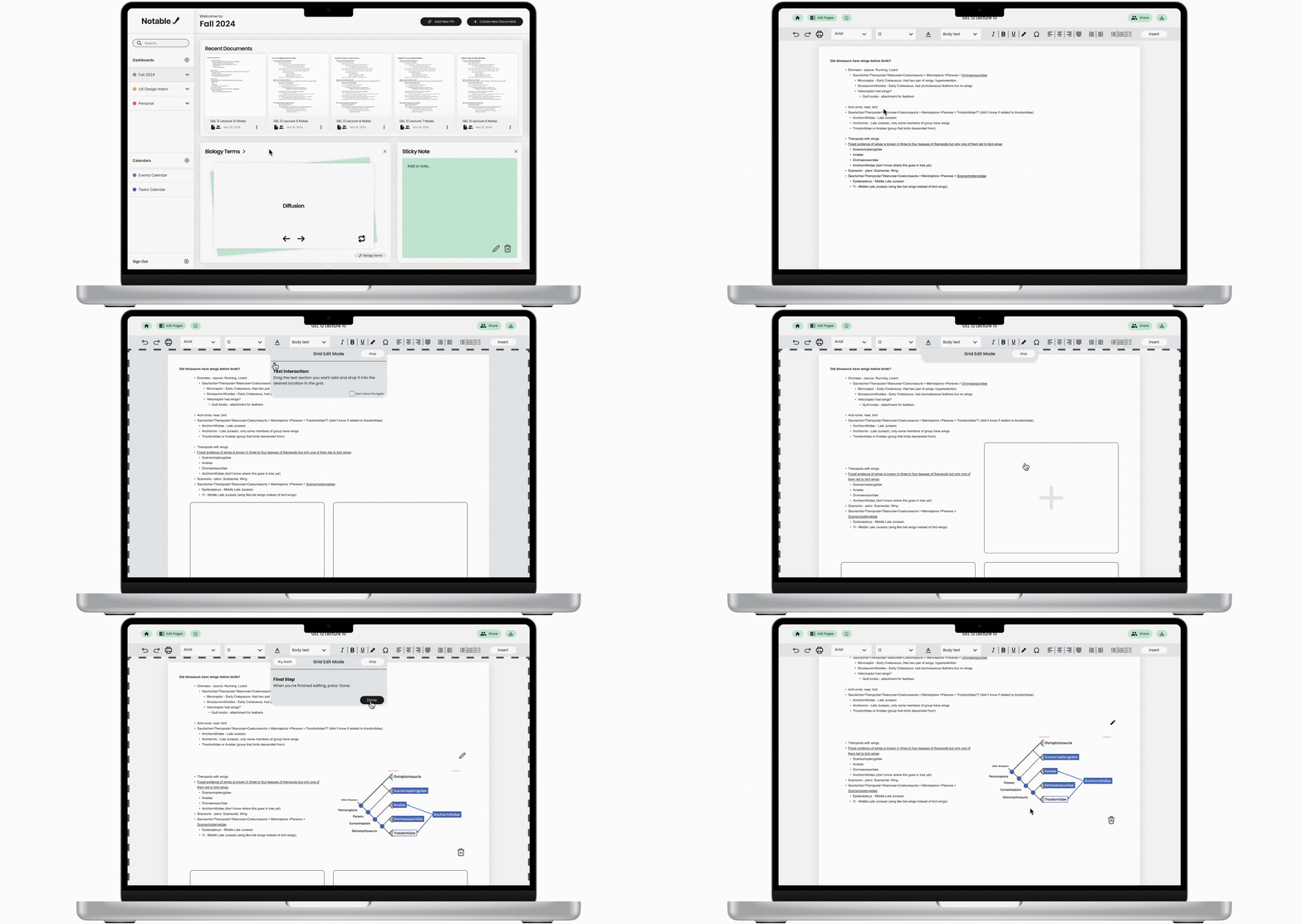
The importing photo feature addresses the problem of poor formatting of imported pictures mentioned in the survey by providing a structured grid for the user to add their photo and text.
This feature allows the user to add text (via a drag and drop) next to images without having to worry about the location of the photo and how it affects adjacent text once it is imported. A grid layout also provides efficiency to on-the-fly note-taking by presenting a consistent layout for users to use.

Hi-Fidelity Prototype — Creating New Documents:
After our usability test results, we decided to implement a column and list view for the notes folders. We learned that users struggled with finding their notes. We also learned that some users preferred a column view while others preferred a list view. As a result, we added two buttons for the users to toggle between their view of choice. We also incorporated a sort-by feature for users to easily sort and find their notes.
By clicking on “Create a new document,” the user is able to select either a blank document or an existing template. For this prototype, we implemented a flash card template for convenient on-the-go studying.

Hi-Fidelity Prototype — Event and Task Calendars:
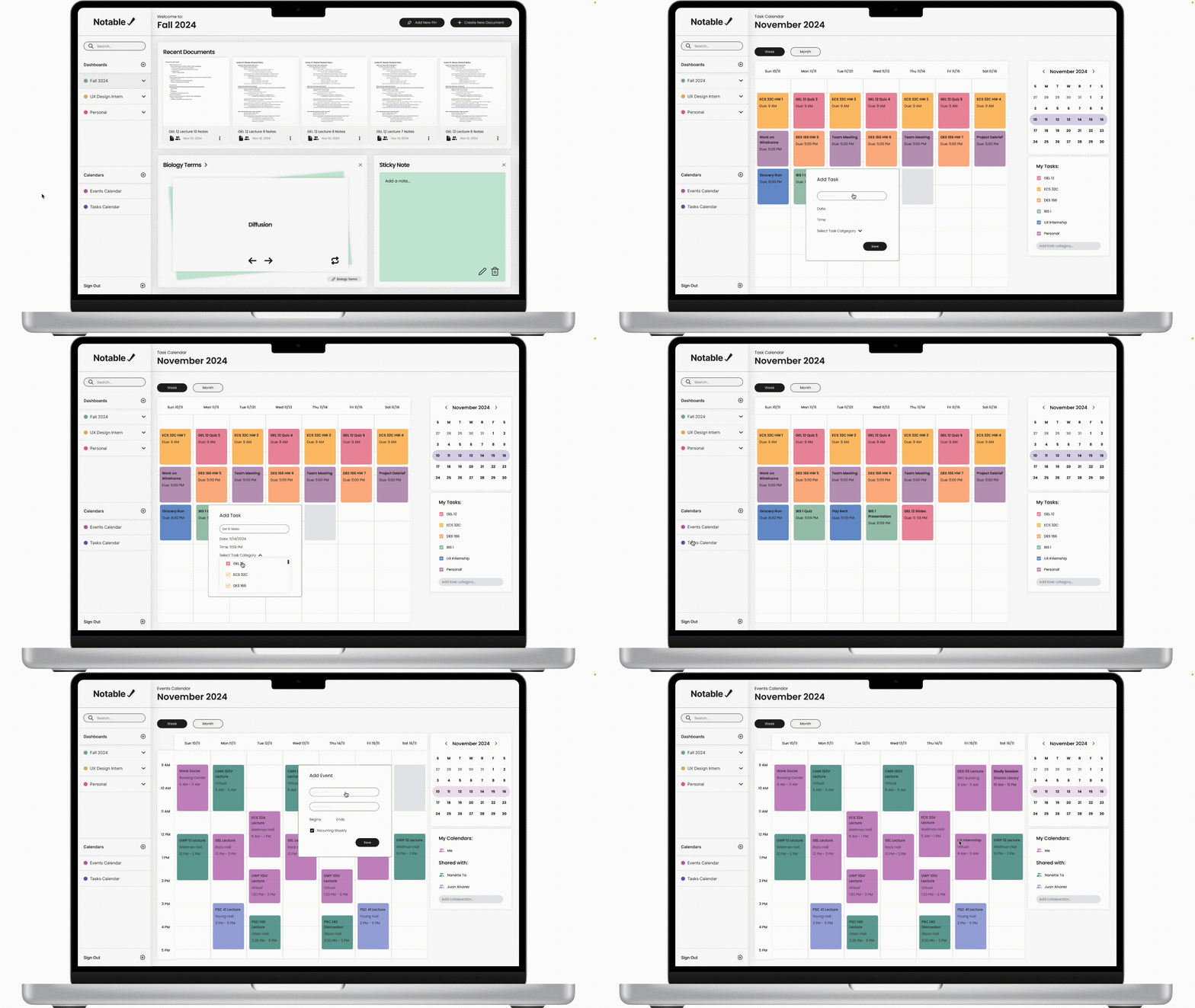
Since calendars were highly used types of media in our user surveys and interviews, we implemented an event and task calendar. The event calendar would allow all users to add their events and share their schedules with their others. On the other hand, the task calendar would allow users to add to-do tasks and action items according to their due dates and times. The task calendar can also be sorted according to task category — such as specific courses.

Presentation Day
During Presentation Day, we showcased our design to three judges and a crowd of supportive friends and Design Interactive board members. Although it was a nerve-wracking and stressful ordeal to present, we all had a lot of fun and were really proud to show off our design.
Our judge was Cheryl Cai, a product designer at Uber. She complimented us on our thorough research initiative and how user-focused our design was. Along with the other two judges, she provided valuable feedback on how to enhance our presentation and emphasized the importance of striking the right balance in designing a product — prioritizing quality over quantity of designs.
Challenges
- Research: Identifying the most relevant pain points and narrowing down our ideation to focus on features most desired by users
- Scope: Expanding our research interview group to encompass a persona side from students
- Time limit: Difficulty balancing multiple complex aspects of developing an application from scratch within a six-week time frame
Key Takeaways
Some of our key takeaways were that people value efficiency and organization in a note-taking application and that many users took different types of notes depending on their occupation (i.e. students vs full-time professionals). As a result, we learned about the importance of customizability and how it is an effective way to address a large and diverse user base.
Next Steps
In the future, we would like to make this project responsive on tablet and mobile views. We would also love to incorporate a dark mode.
